
Consider NPSH and BEP when choosing a pump
06/19/2018
How do I use the information on a pump curve to select a pump for my system? A pump curve (sometimes called a performance curve) is a graph that shows the total head, power, efficiency and net positive suction head (NPSH) where a 3 percent head loss occurs (NPSH3) plotted against rate of flow. These curves contain extremely important data that pump users need to analyze and interpret for proper pump selection and efficient operation.
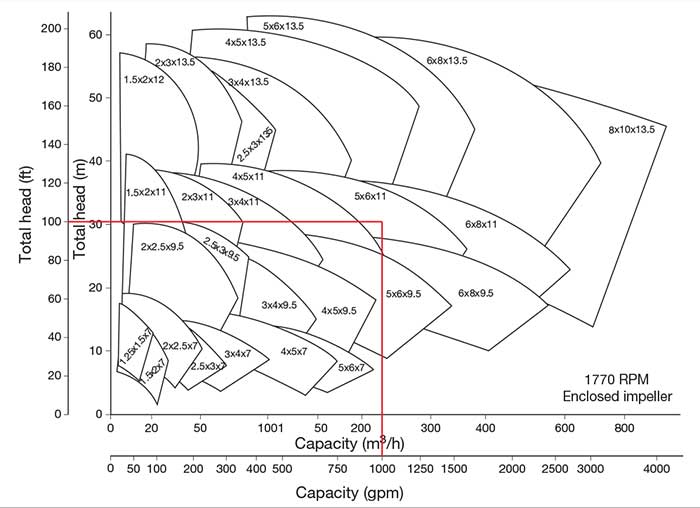 Image 1. Pump family selection chart (Images courtesy of HI)
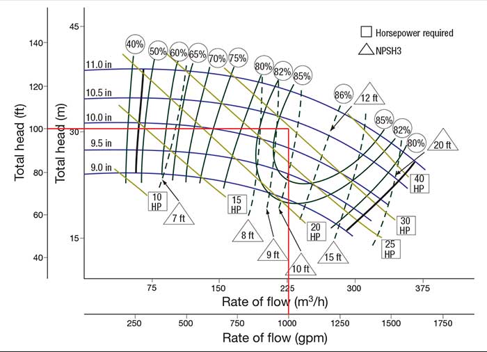 Image 2. Published pump curve
- The Y axis (vertical) on this curve is the head in feet and meters, and the X axis (horizontal) is the capacity (flow rate) in m3/h and gpm.
- Each downward sloping blue line is called a head capacity curve.
- Each number above the head capacity curves to the right of the Y axis represent different impeller diameters. Total head is reduced when the impeller diameter is reduced.
- The numbers in the circles above the topmost head capacity curve are the pump efficiency, and the lines stemming from these circles are lines of constant efficiency. The triangles that contain a number and word “NPSH” are constant lines of NPSH (in feet) that the system must supply for the pump to operate with a 3 percent head loss. NPSH margin above this value is required for the pump to operate at the published head.
- The diagonal lines that run through the head capacity curves signify lines of constant pump input power.
- The impeller diameter that meets the duty point falls between 10 and 10.5 inches.
- The pump is 85 percent efficient at the rated point and 86 percent efficient at the best efficiency point (BEP).
- At the rated point, the shaft power will be between 25 horsepower (hp) and 30 hp. To ensure a non-overloading condition at the end of the curve, a 40-hp motor may be required.
- NPSH3 is between 9 and 10 feet at the duty point.
See other HI Pump FAQs articles here.